A New Running Map
- I use Strava to manage my runs, not Garmin Connect. I use tapiriik to move my running information around. I love tapiriik.
- I ended official support for TileMill in 2016. The Mapbox way to make this kind of map is now Studio. TileStream Hosting is now just called Mapbox.
- I now run with a Polar M400 running watch instead of a Garmin. Too many Garmins broke on me.
- I no longer work at Development Seed - my current job status is listed on /about.
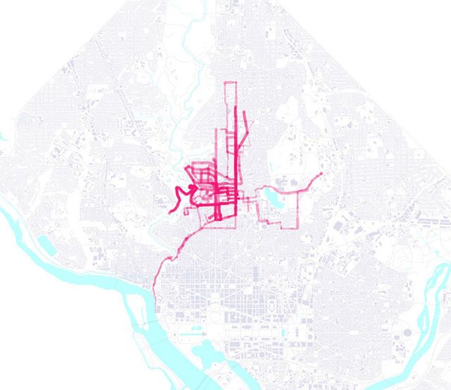
It's about time to make a revision of my old running map - something that I threw together in February with a few scripts and an über-early version of TileMill.
I run with a GPS watch that records heartrate, position, and elevation, and then can send it up to Garmin Connect, which used to be awesome until the original team left. Right now, it's perfectly fine for my purposes, though it severely lacks good export functionality - I'll address that later.

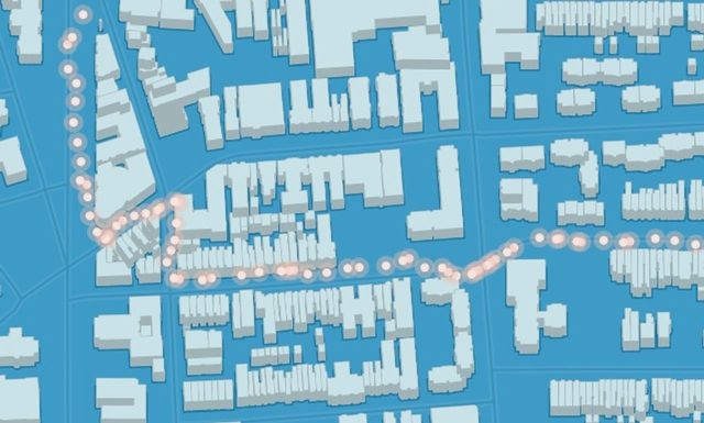
The main lack with the old map was that it represented my heart rate with dots at each GPS trackpoint. That's easy to pull off, since it doesn't require any postprocessing of the data, and the style in TileMill is as easy to make - just scale dots.
Ideally I'd have something that more accurately represented what's happening - I'm not running from circle to circle, but continually running, with smoothly shifting variables of heartrate, speed, etc. Any info-nerd will know the reference - the map of Napoleon's Journey, as drawn by Charles Minard, uses multi-width lines to represent troop numbers. Wikipedia claims that these are flow maps, though the term isn't quite precise or established.
I couldn't find many tools to do what I wanted to do, so I had to build quite a bit. This time around I polished up my Garmin exporter tool, which I'll call disconnect.rb - a Ruby script that uses mechanize to simulate a browser - so that private runs can be downloaded.
So, after downloading runs (never enough - 63 totalling 174 miles), it's time to start thinking about making this crazy kind of map. I'm kind of starting from scratch, so it will require some of the more difficult things in the world - maths.
Maths
note: I'm not a real mathematician, I can only pretend to be one with a computer handy and lots of chances to get it right. If you've got corrections or improvements to this technique, note them in the comments!

Okay! So, step one: we have all of the trace points, and can put them on a map. This is the most normalized form of the data that will be - geographic libraries tend to think of geographic features as basic building blocks - combining 10 points with lots of nice data into one line feature will give you only one place to put data - in the line, not in its 'point components'. It's a reasonable assumption, but makes some things difficult.
OGR is the bread-and-butter library for doing anything with vector data, and Shapely gives you nice higher abstractions and a few geographical operations that are super useful. Both have great bindings in Python, so that'll be the language of choice.

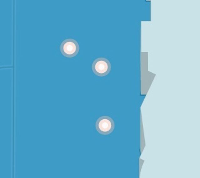
So the geometry challenge is to create a variable-width polygonal line from a series of dots and values? Imagining that the points are connected by an invisible line, the challenge is to find an angle that's perpendicular to the path at each point. Luckily, finding the angle between two points is much easier with the atan2 function, that not only figures out the angle, but puts it in the right quadrant. Just watch out that it takes (y, x) parameters.
from math import atan2

def angle(a, b):
    return atan2(
        a.coords[0][1] - b.coords[0][1],
        a.coords[0][0] - b.coords[0][0])
See? Very cool. It's simple enough to derive the atan2 function, but having it 'just there' takes away a bunch of the annoying code-rewriting.
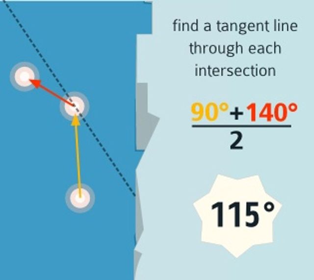
Next up - we've computed the angle at each line segment. Finding a tangent line is as simple as averaging the segment 'before' and 'after':


So now the idea is to project line segments out perpendicular to this vertex, which is as simple as getting 90° angles on both sides, and then figuring out the unit vector in those directions. To get the x and y coordinates of a unit vector in a specific angle, you can just use trusty old sin and cos.
# now project outwards.
x = cos(e)
y = sin(e)
Then scaling the width of the line is as easy as multiplying the x and y components of one of these unit vectors and then appending them to the original point.
Fudging Data
As with all data sources, GPS data isn't pretty when it's untreated. Specifically, jitter - my relatively straight runs occasionally have complete turnarounds in the data, or large deviations from the road centerline. Classic line simplification doesn't help much here - it's basically an algorithm that keeps differences rather than nixes them.
I went with the simplest algorithm that would work - a rolling average smooth.
def average_smooth_n(x, n=5):
    weight = 0.7
    for i in range(n, len(x) - 1):
        before = x[i - n:i - 1]

        def get_x(m):
            return m[1].coords[0][0]

        def get_y(m):
            return m[1].coords[0][1]

        before_x = sum(map(get_x, before)) / (n - 1)
        before_y = sum(map(get_y, before)) / (n - 1)

        x[i][1].coords = [(
            x[i][1].coords[0][0] * weight + before_x * (1 - weight),
            x[i][1].coords[0][1] * weight + before_y * (1 - weight)
        )]

    return x
Making Shapes
Finally, the question came up of how to actually turn these point-filled maps into maps with actual polygons. This is where Shapely came in handy again: it has some handy logic for doing convex hull calculations. So even though I'm storing points in left_points and right_points arrays, these points actually fall on different sides of the line based on the line's angle. Shapely saves me from figuring this out - every four points are constructed into a box, regardless of order.
From Data to Map
Finally, I used TileMill to render this data into a semi-pretty map - as cute as my software-developer tendencies could do. Props to DC's open data initiative for background data - buildings, water, parks, and roads - and Color Brewer for holding my hand through choosing classy colors.
And to get from that map to the web, I posted my first map to my bright and shiny TileStream Hosting account, which now serves from the MBTiles
Alternative paths
You could also 'just' combine runs of points into short line segments, assign them a value, and use variable-width line strokes to produce something of the same effect. That solution could never really solve the problem of being able to join multiple widths and represent fluid changes that well. I'm also really interested in the fact that this method leads to geographical features - I've added multiple colors based on heartrate, but otherwise the result could be converted into GeoJSON and used with polymaps or whatnot. I'm creating geographic data as visualization, rather than an implementation-specific symbolizer.
The Site
I built a quick site to show off this map which only has one cool feature - instead of tooltips disappearing when you roll your mouse over the line, they shift downwards on the page. If you run your mouse along a line, then you create an ephemeral bar graph of the bpm measurements along that line. It's a neat sort of incidental visualization, and also kind of a cool psychological mimic behavior - you're more or less reenacting a thing to take a measurement of it.
So check it out - it's a fun little experiment, hopefully to be followed by a few more.
(full disclosure: I had something to do all of the MapBox tools I used, and I get a free TileStream hosting account for working at DS)
