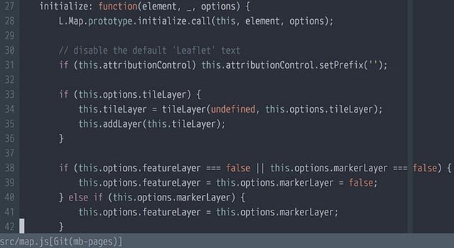
The Best Font for Programming: M+
The best monospace font for programmers is M+.

I met M+ in a chance encounter, trying out the ill-fated kod editor. It's an unusual font, but it clicked and has been my stable choice for more than three years.
Much has been written about fonts for programming, but this lovely face tends to miss the cut.

Retina screens make subtle strokes and thinner weights look better, and M+ does that: its thin is ethereal, almost a stick font. I only use retina screens: at lower resolutions, bitmap fonts like Terminus can shine.

It's much narrower than average, so 80 characters per line can fit in less than half of my screen width - so I can use a vertical split in vim to edit two or more files at a time.

It covers Basic Latin, Latin-1 Supplement, Latin Extended-A, Kanji and Kana: beyond that, only a few monospace fonts like DejaVu have coverage.

It's clear: 0 is slashed to differentiated it from O, and 1 is easy to tell apart from I, and l.
Give it a shot? M+ is totally free and open source, and installable on Debian & Ubuntu as fonts-mplus.