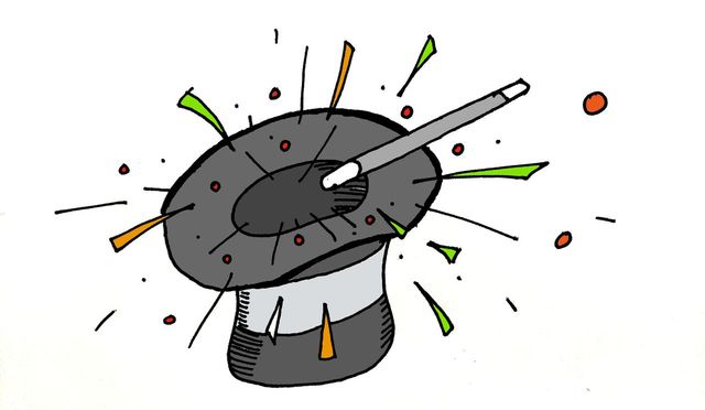
Against magic
Animation is visual music. Give users a great, delightful experience with transitions. Rather than thinking in screens, we are now thinking in stories.

With the advent of CSS transitions, animation libraries, and motion-centric mobile interfaces, designers and developers alike have been psyching themselves up to add delight to every product they work on. Countless Medium posts advise them on the best animation curves to use, on how they should integrate Disney movie principles into each transition. There are a few concrete, testable advantages of animated interfaces, like object constancy, your ability to associate objects before with objects after a change.
But if you're creating a user interface for an application, let me propose the other viewpoint.
Animations slow down interfaces
Let's say you have a tabbed interface, and you're animating between tab visibilities - the panes slide to the left and right when people navigate around. This animation takes, maybe, 200 milliseconds.
If, instead, you had the same tabbed interface and simply loading the panes took 200 milliseconds, that would be considered a bug - certainly it should render in under 100.
And for experienced users, the benefits of animation are overshadowed by their annoyance - they're like unskippable cutscenes in a video game, something included to guide beginners that just frustrates people who know what they want to do.
The wow effect wears off
Animations can pump up the curb appeal of applications. That's why, in some investor slide decks and demo videos, the video production team takes it upon themselves to add egregious, swoopy animations to UIs that have no such thing.
This goes hand-in-hand with the slowness of animations. For example, macOS's 'Spaces' animation slows down space switches by over 100 milliseconds, to the point that it makes quite a few people nauseous. I disabled it because I would start typing before the animation finished, and nowadays I use iTerm's non-native fullscreen mode to get transition-free toggling.
Fast is better than fancy
A great example of this is Figma. The UI is almost entirely free of animations. You click on a document and it's instantly highlighted. Everything from background transitions to toggling UI elements simply happens instantly.
We took the same approach with Mapbox Studio, and for the most part Observable is the same way - no opacity-translate-skew fireworks when you hover a menu item. It just works.
Software that works is magic. Software that tries so hard to be delightful is just saccharine.