Playing with bikeshare data, part one

Since July, I've been archiving data from the Citi Bike GBFS feed. Every five minutes, I have a datapoint for each of the roughly 2,090 stations with numbers for how many bikes are available or broken, and how many bikes are electric. It's a long-term project that combines my interests in bikes, large datasets, and visualiation. It's far from finished, though: these are just casual, early "lab notes".
Citi Bike
For those unfamiliar, Citi Bike is New York City's bikeshare program. I ride it to work and back every day.
Citi Bike gives me hope for humanity. Yesterday I was reading a book out on Pier 6 in Brooklyn Bridge Park, and I saw a lot of people riding those bikeshare bikes - young couples on dates, a mother following her daughter's little bike, every age and demographic. The bikes make people happy, give them a sense of freedom and ease that's hard to find in the rest of city life.
They're accessible, too: there are stations in most neighborhoods, the only exceptions being outer Brooklyn, where they're slowing expanding the network, and South Williamsburg, where local opposition has blocked them. You can buy a membership which is $205/year, or $5 a month if you use SNAP or live in public housing. The program is accessible, the bikes are stable and easy to ride.
It's a good thing.
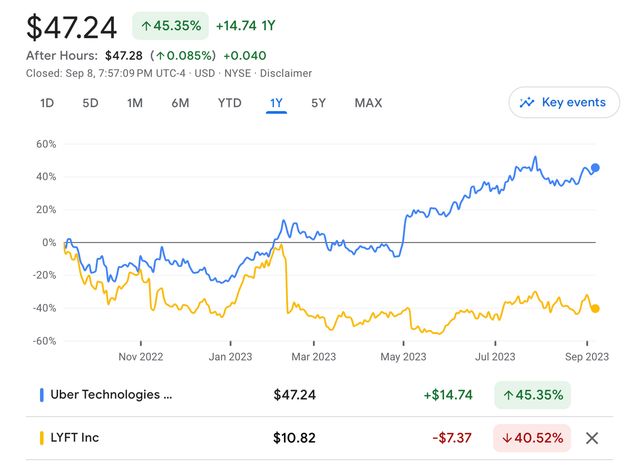
But it's embattled. By the anti-bike activists, whose arguments don't bear repeating. But it's also facing a crunch from the city and the bikeshare operators. Despite the program growing in popularity every single year including this one, Lyft has been hinting that it might sell the business unit. Uber benefited from the pandemic and has diversified into freight and food delivery, but Lyft notably hasn't.

They're not doing very well as a business. So, Lyft wants to reduce their lines of business and focus on getting people into cars. So much for combating climate change.. Lyft already pulled out of their contract with Minneapolis, so the worst could happen for New York.
My project
Let's get one thing out of the way first, this is the millionth project relating to this data and that's a good thing! Here's a cool analysis of bikeshare data and gender, and another one with cool graphics, and another one with WebGL.
Bikeshare makes for a really cool dataset, because it's geographic, free & easy to obtain, and also because we systematically undervalue the privacy of people using public transit and microtransit while giving drivers expansive privacy rights which aren't enough because they bend their license plates so that they don't get speeding tickets in school zones and tint their windows so much that they don't even realize they've killed people in crashes.
Bikeshare is a good dataset, though.
GBFS
Most of the bikeshare-related projects are tinkering with the trips dataset, which shows start & end points for a given trip. That's fun data to visualize, but I'm really interested in different dimensions of the dataset. So, I'm using the GBFS feed, which instead shows the capacity and status of the docks where the bikes are parked.
GBFS is a standard for how cities with bikeshare systems share their data. In practice, it's a really nice specification to work with: it's pretty well-designed, simple, easy to parse. And Citi Bike's system data implementation is stellar. In the whole time I've been working with it, I haven't noticed downtime or a significant bug. The API responds quickly and doesn't require any kind of authentication. Whoever implemented it did a good job.
The Worker
The rest of the system is still kind of in flux, but the archiving step has been working well for months.
It uses a Cloudflare Worker, which is scheduled to run every 5 minutes. It fetches from the API, gzips the response, and saves it to Cloudflare R2, which is Cloudflare's equivalent to Amazon S3 - a storage service.
The worker itself is written in TypeScript and it fetches, compresses, and stores the data:
export interface Env {
  DATA: R2Bucket;
}

export default {
  async scheduled(
    controller: ScheduledController,
    env: Env,
    ctx: ExecutionContext,
  ): Promise<void> {
    const res = await fetch(
      "https://gbfs.citibikenyc.com/gbfs/en/station_status.json",
    );
    if (!res.ok) {
      throw new Error(`Endpoint down, status: ${res.status}`);
    }

    const compressionStream = new CompressionStream("gzip");
    const compressed = await new Response(
      res.body?.pipeThrough(compressionStream),
    ).arrayBuffer();

    const time = new Date(controller.scheduledTime);
    const key = `station_status/${time.toISOString()}.json.gz`;
    await env.DATA.put(key, compressed);
    console.log("OK: Scrape done");
  },
};
And is scheduled using its wrangler.toml configuration file:
name = "station_scraper"
main = "src/index.ts"
compatibility_date = "2023-06-29"

[[r2_buckets]]
binding = "DATA"
bucket_name = "citibike-data-1"
preview_bucket_name = "citibike-data-1-test"

[triggers]
crons = [ "*/5 * * * *" ]
I have to bind the worker to the R2 bucket to give it access, and then that's it - the worker runs on its own. Each new version of the station_status endpoint is named with a timestamp so that I can fetch a specific day by listing objects with a prefix.
The Collector
The Worker produces gzipped JSON - not the best format for analysis. What is the best format for analysis? I think the current answer is Parquet. I wrote about Parquet a little in the context of geospatial formats, and my friend Kyle has been singing the praises of Parquet and Arrow, so I was excited to take a look.
I implemented a "collector" in Rust for fun, and because I didn't want to install Python on my laptop. There's a good canonical implementation of Parquet and Arrow, arrow-rs, in Rust. To read JSON, there's serde. To handle dates, there's chrono.
Overall, it was a good time hacking it together. As long as I avoid refactoring and splitting up functions, I can write Rust without bothering the borrow checker too much. The only thing that really got me was around the edges of Parquet: how should I structure my data - is it better to have lots of rows, or lots of columns? I could picture three different ways, at least, to model this data, and it was hard to figure out which was best. Plus, some of the knobs to optimize Parquet were confusing to tweak.
But anyway, the collector is able to take about 2 gigabytes of gzipped JSON and turn it into a 180MB Parquet file: a good 91% savings. I suspect that I could do better with tweaking some other settings, and being smarter about structuring the data.
Web
This is the part I'm still not sure about. I shipped a demo a while ago on bikesharecharts.com, but I think it needs a rethink. There are a few things bugging me about the existing demo:
- It's doing too much custom visualization code: it's rendering charts in a combination of raw d3 and Svelte. It's annoyingly manual to tweak the charts.
- The charts aren't very understandable anyway, and I don't really think that there needs to be this small-multiples view of all the bikeshare stations as a stack. It's cool, but it doesn't tell a story.
So, I'm tinkering with other solutions. Part of the appeal of Parquet is that I can use it with DuckDB, a database that can run in the browser and let me query the data with SQL. DuckDB is very hot right now and is great, except for how much time it took me to figure out how to get it to convert timestamps.
Mosaic is like Observable Plot combined with DuckDB. It's very exciting in theory but it's been hard to get the pieces to fit together and become familiar with the project by reading the documentation.
Observable Plot is itself a viable option, and connecting it manually to DuckDB is very possible, though it'll be more code to connect it in the efficient way that Mosaic does. But it's very limited in terms of interactivity and this project could really benefit from at least being able to zoom into a day range.
So, for now I've hooked up an Observable Notebook to explore the dataset. It's fun to be able to use Observable as just a user, after helping build the platform itself in its very very early history. It's a good platform, and lends itself pretty well to this problem area - it's super easy to wire together inputs, processing, and visualization steps.
Plans
- If the Citi Bike system changes, like if Lyft pulls out of its contract, or New York takes more ownership over the program, I think this will be a great dataset to see the effect of the change.
- There are a few places in the city where bicycle rebalancing seems to be failing on a regular basis. For example, docks in Red Hook are consistently full. I'd like to figure out how often these docks are getting rebalanced - how often Lyft or Motivate or a third party is, in fact, driving to the docks and moving the bikes. There's an attempt at crowdsourcing that rebalancing by encouraging people to ride bikes from full docks to empty ones, called Bike Angels - does that have any effect?
- Based on the demand curve of each station, it should be possible to figure out which are associated with workplaces more than homes - which absorb bikes between 9-5, and which lose them?
- In the event that there's system expansion, it'll be interesting to see how quickly there's adoption - outer Brooklyn expansion is likely in the short term, whereas South Williamsburg expansion might never come.
In any case, I'm having fun with it, and enjoyed the excuse to produce a watercolor yesterday!
@macwright.com on Bluesky, @tmcw@mastodon.social on Mastodon